Showing posts with label Rent and Sales Report. Show all posts

Wednesday, June 29, 2016

Rent Tracker

Over the last few years we've been looking at various ways of measuring rents in New South Wales, and pointing out that there is a really powerful source of data to which of us tenants who pay bond contribute.

The Rental Bond Board holds nearly 800,000 bonds and each one tells a story - what the rent was for a particular property at a particular time in a particular location. If you add all of those stories together, you get the Rent part of the Rent and Sales Report, as published by Family And Community Services.

Today we released the report version of Rent Tracker. We've dug in to the Rent and Sales Report and drawn out extra data, to help give more context to changes in rents. We've also looked at advertised rents as well as the actual rents, to help add depth and understanding to the stories reported in the media.

This data source should be seen as one of the go to sources of information about what is happening in renting. It's important to know what landlords and agents hope to get for a property they advertised, but it's at least as important to know what they actually do get. As well as ongoing improvements to the report, we'll keep blogging about how this data can help understand the state of the rental market!

Check out Rent Tracker here.

Thursday, June 16, 2016

The rent (assistance) is too damn low

Sydney, we have a real problem.

The rent in Sydney is so high now that even historic pockets of affordability are way out of reach for people doing it tough. We might have been able to rely on public or social housing if supply had kept pace with the growing population, but it didn't.

That shortfall has combined with pressure from moderate income households - also desperately trying to keep their budgets in check - and landlords taking full advantage to meet their exorbitant interest costs, to squeeze this city dry of affordable rental housing. The most graphic way of seeing the impacts for the last few years has been Anglicare's Rental Affordability Snapshot. Now we have a second way of showing the problem in the form of National Shelter's Rental Affordability Index. Sydney is a sea of red and orange, showing the lack of affordable options.
Sydney's rental housing. The redder it gets, the cheaper it ain't.
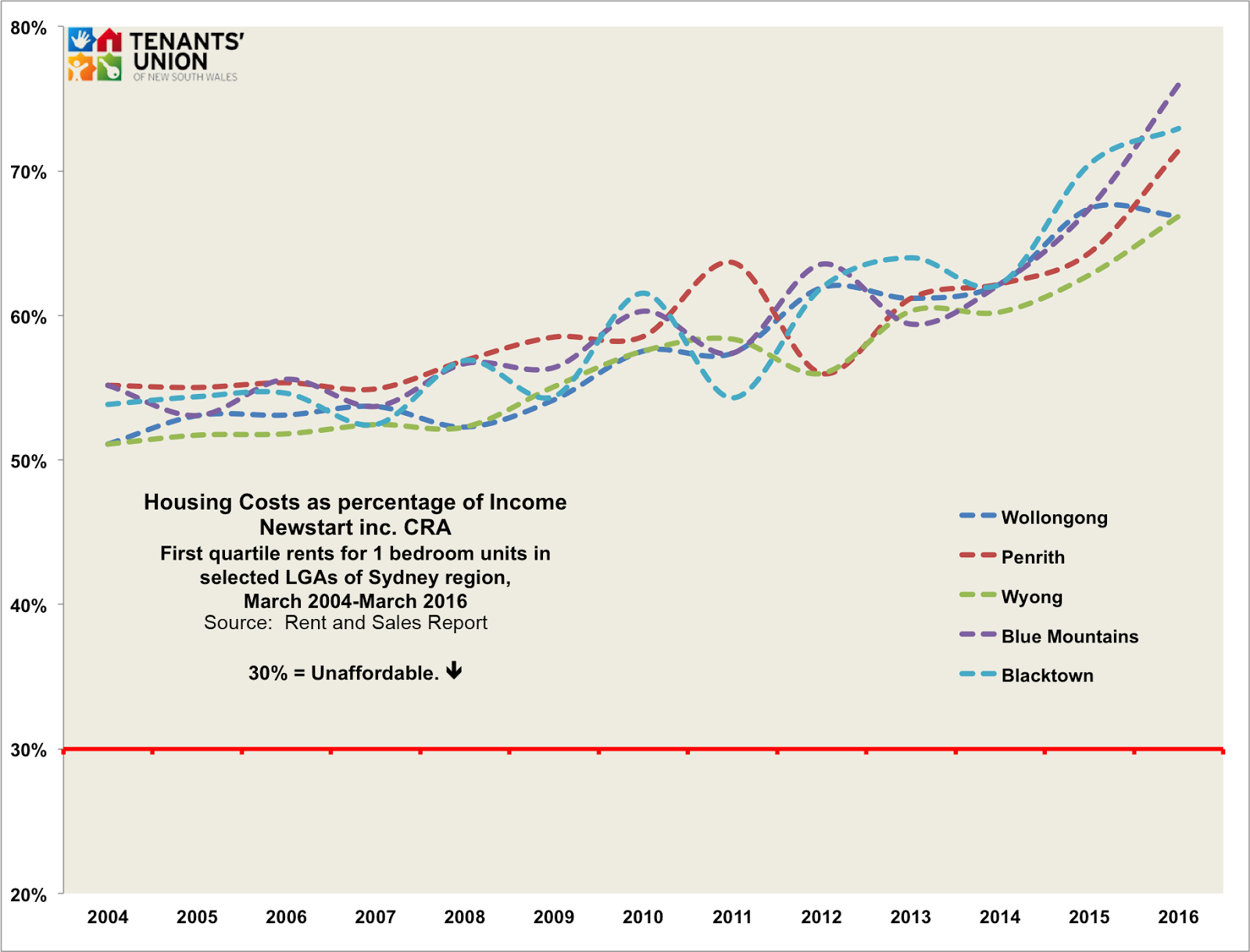
At the fringes there appears to be some hope - green looks promising, if you receive close to a moderate wage. But we wondered about tenants surviving in this city on Newstart, and receiving Commonwealth Rent Assistance (CRA). We crunched some numbers, and the news is not good.

We've looked at how much a one bedroom apartment would cost to rent in some of the more traditionally affordable parts of Sydney and surrounds, and compared it to the income a single person person receives on the Newstart allowance, plus CRA. We can see the numbers going back to 2004 when the Rent and Sales Report began reporting on first quartile rents for each Local Government Area. The "first quartile" in this case is the level of rent halfway between the lowest rent for new bonds lodged in March of each year, and the median, or middle rent.

We chose these five Local Government Areas as being both historically and currently some of the most affordable areas of the Sydney region, as well as representing the northern, southern and western areas within a relatively accessible distance from the city.
Clearly, Rent Assistance has never been about paying the rent in full. But it does make a real difference in bringing a home within reach for a lot of us who would struggle even more without it.

Click image for larger version
Government figures show that more than a quarter of people in NSW who receive rent assistance would pay more than 30% of income if not for CRA, and 15% would otherwise be paying pay more than 50% of their rent. However, in NSW we are still left with 15% of people, or nearly 70,000 tenants, who are paying more than 50% of their income even after receiving CRA.

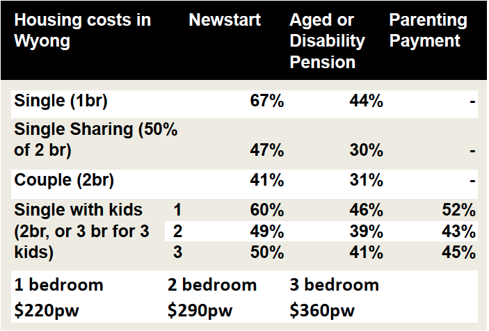
The #votehome campaign is calling for a 30% increase in rent assistance. What would that look like? We've applied that to a few different household types in Wyong, the cheapest LGA for lower quartile rents in Greater Sydney. These figures show what percentage of income is taken up by rent after receiving CRA. Remember, anything over 30% is considered unaffordable if you receive a low income:


With a 30% increase in CRA:


OK, it may not look like much, but it translates into around $20 a week more to spend on food, utilities, clothes or health. While the other income support payments look better, it is important to keep in mind that people living with disabilities, and those with kids do have other expenses that can really stack up. Ultimately, Newstart is just inadequate as a payment and needs to be increased, but an increase in rent assistance will still make a substantial difference.

You can support the increase by signing the #votehome petitions here.

The rent figures were derived from the Rent and Sales Report. We'll be releasing the first edition of Rent Tracker shortly, where we'll dig in to the reality of rent prices in NSW and explore the wealth of knowledge that the tenants of NSW provide simply by paying bond.

Friday, July 31, 2015

Caution following REI's lead over rent drop

Breathless good news on rental affordability from Tele land this week.
Citing Real Estate Institute of NSW data, the state's favourite tabloid told us that rent in some of Sydney’s blue chip neighbourhoods – including Bondi Junction, Neutral Bay, and Manly – is down by between $25 and $70 per week.
REI president Malcolm Gunning attributed this fall to a ‘glut’ of new apartments released onto the market in 2014. 
A strong second quarter does not a triumph make
But we suggest caution before jumping to any of the same conclusions. Whilst REI data is not freely available to the plebeian blogosphere, it’s worth noting that the basis for the article’s claims appears to be a REI study of the second quarter of 2015 alone. This is a perilously short period of time from which to be drawing any bold conclusions such as these.
What's more, as the second quarter takes place over both a university break and the feared ‘polar vortex’ period, autumn and winter variations for rent in student and waterfront neighbourhoods are also relevant. Indeed, of the ten suburbs cited in the article, six are beachside or waterfront, and two are situated in the immediate vicinity of Sydney University or the University of New South Wales. Bondi Junction arguably fits both criteria.
Remember too that REI data is based on asking rather than actual rents. As we noted recently, this paints a misleading picture of the market. Far more reliable is the equivalent data in the Rent and Sales Report – based on the rent paid in new tenancies, as discerned from rental bonds lodged with Fair Trading (i.e. almost all of them). And published free of the desire to push any particular narrative. 
That, too, is a quarterly publication, with the second quarter edition due in a tantalising 21 days. We will wait on its findings before making any breathless conclusions of our own.

Thursday, July 9, 2015

Highest rent increases in 5 years?

There are a few things to keep in mind when reading these articles. Let's have a closer look.

Domain use asking rents, not what places actually go for. As discussed in our rent tracker articles (more to come!) RBB data is a much better data source because it records what rent places are actually going for.
If we go back a year into the Brown Couch archives, we can put into context Domain's claim that this is the highest rent increase in 5 years.


For more than 2 years, Domain (APM) had houses pegged at 500 per week. That spike in September 2012? That is actually a higher percentage jump than the one reported today (a full 2% rather than the 1.9%). More importantly, they are both $10 a week- so the same dollar value. That jump was also described as the highest increases, as was the subsequent rise in March 2014.

The real story was seen in the authoritative Rental Bond Board data, which showed a more regular set of increases with some large jumps over 2014.

Now let's dig a little deeper into the reporting. While house rents were reported as increasing with the usual hyperbole not a peep was heard in the article about apartments. Guess why? Check out the quarterly change in apartments below. 0% rent increases. We'll wait for the release of the June Rental Bond Board data, as again there may be a different story in the real world, but it doesn't fit with Domain's narrative, so it doesn't rate a mention.


Dr Wilson, the senior economist at Domain Group, says some other things worth challenging in that article too: "We would have thought that given that we have record numbers of investors, supply might have caught up to demand, but the new supply just can't match the demand," he stated.

There are two things to notice- a record number of investors does not automatically translate into new supply, it could just as easily mean less owner occupiers. The low rate of first home owners buying in would suggest that may be a likely scenario. While we're at it, the low rate of first home buyers becoming first home owners is not to blame for rent increases- they're not the ones setting the rents!

More importantly though, most new supply, particularly investor-driven supply, is in apartments, not stand alone houses. Domain's data shows very flat growth in apartment rents. We're surprised they missed that.

The real deal
What this data, and the Rental Bond Board data doesn't show is what is happening to the people already in their homes. To an extent, the CPI rent index might capture some of that, but it is mixed in with new rentals as well.

From our Housing Affordability Survey of 2014, and many subsequent conversations with tenants, what is clear is that people are worried about making a fuss about various issues with their houses, because of possible termination or rent increase. Both outcomes lead to another data point for Domain and the RBB data as it is unlikely the rent will stay at the same level between tenants.

Also we'd like to point out that not everyone who rents is a frustrated home owner- many people who rent are just frustrated home makers. A recent article put it marvellously
"The point of the iconic quarter-acre aspiration in the Australian psyche is not the actual white picket fence or the big backyard; it’s stability and comfort. Our rental market is the opposite not because of the large number of apartments, but because a sense of ownership and security is virtually impossible for many."
As more people stay in rental market for longer, government should consider making that stay more comfortable. They can easily do so, and soon.

-------------------------
For more on the Tenants' Union platform of fair Rent Increases and more, check out our Just Renting policy page.

Wednesday, December 17, 2014

Rent Tracker - Sneak peek

We've previously written about the various ways people can track rent movements in Sydney. We plan to continue this practice in our new series "Rent Tracker."

This is a brief sneak peek while we work on adding all sorts of improvements. We've two substantial changes to note.

Previously, we tracked the 'asking rents' reported by APM against the rents tenants actually pay, as presented in the Rent and Sales Report and in the CPI - Sydney Rents series.

For this and subsequent issues, we've added two new 'asking rent' trackers - CoreLogic RP Data (until very recently known as RP Data), and SQM Research.

To make it easy for you, we'll be keeping these colours for each series in all our graphs! Clicking on each graph will get you the bigger version.
First, let's introduce CoreLogic RP Data and SQM Research.

Both are independent data researchers that primarily focus on property. CoreLogic is an international group that acquired RP Data in 2011, but only recently changed the name to match.

We will primarily be looking at RP Data's Quarterly Rental Reviews, or Quarterly Property Reports where the Review is unavailable.

SQM Research publishes a Weekly Asking Rents Index on their website, which will be the source of data for them. SQM publish prices for all houses, and 3 br houses, all units and 2 bedroom units. For consistency with the other measures, we will be using their all houses and all units measures. SQM publish a methodology for their index here.

Both CoreLogic RP Data and SQM Research primarily scour property listing websites for asking rents to gather their data.

Sydney Rents

First, median rents for houses and units for the last 18 months, and the difference between asking rents and actual rents is noticeable.We've adjusted for inflation to September 2014 here, which produces a flatter image, though the slow rise is clear as well. 


SQM prices houses at a much higher level than other data houses, we'll be seeking comment from them. Interestingly, their unit prices are lower than even the Rent and Sales Report.


We're also looking at producing a couple of indexes to try and give an broader perspective on the narrative that gets played out in the media whenever rent prices are reported on. The following graphs show one of two ways of we'll use to indexing our five data series. The indices purpose is to try and represent movement, rather than merely the data points of the series.


These indices demonstrate the relative movements of rent prices together. This represents clearly that the actual rents have been rising much faster than the asking rents would suggest, particularly in houses, and particularly with APM but certainly all three asking rent series show flat periods while the actual rents catch up. This becomes an issue when the media narrative describes flat periods in prices, when we should be talking about how much more unaffordable rents are getting!

We'll begin to look at what all this means in the New Year, and look forward to bringing you more numbers, including regional reporting, in subsequent instalments!

Friday, August 8, 2014

Entrails and Crystal Balls: Tracking rents in Sydney

Much like pinning the tail on the donkey, setting rents is an inexact game for landlords. Too much and no one can afford to rent the place, too little and you're missing out.
And if you're a tenant, you'll want to have an idea of where rents are going, particularly if you're looking at a new tenancy or if you've got a notice of rent increase in your current one.

Now, there is an industry of statisticians, researchers and pundits more than happy to help track and sometimes predict what everyone else is doing.

We’ve looked at three ways to track rents that use quite different methods to come up with an answer. And the answers they come up with are quite different. Some of them may be more useful, and more reliable, than others. 

Unfortunately, the least reliable measure may be the one that gets the most attention.

Australian Property Monitors is a Fairfax-owned group that, amongst other things, tracks the asking rents for Sydney properties on the Domain property website and paper form as its measure.

As a Fairfax subsidiary, it is unsurprising that their quarterly results on asking rents are published with much fanfare. Fairfax journalists pore over the results looking for meaning in the numbers.

A quick search on Domain showed 14 873 properties available for rent in the Sydney region on their website on the 4th of August, so APM's sample size is considerable. The problem is that these are 'asking rents' – and what landlords ask for, they may not actually get.

Also, from time to time APM revises past figures with corrections. The corrections are not that common but first impressions do last. For the analysis present below, where there is a difference we have used the numbers published when first publishing that quarter’s reports, and not any corrections made later. APM’s publications with their current methodology extends only back to 2010 so we’ll be looking at an admittedly small duration. And finally, these figures are for Sydney only – not the rest of the State.
The Australian Bureau of Statistics calculates CPI by looking at costs of a range of standard living costs and comparing those costs over time. 22% of the CPI is made up by housing costs- both purchasing and renting. From the ABS:
“Rental payments for privately owned dwellings in the metropolitan areas of each capital city are obtained from real estate agents under a matched sample approach, i.e. prices are collected for the same sample of private rental dwellings every quarter.”
Public housing rents also factor into the rents index. The ABS gains this information from the various state housing authorities.

The CPI – Rents index for Sydney, then, comes from a sample of Sydney real estate agents as well as Housing NSW for the actual rents paid on some of their properties. This means it includes current rents on properties that may have been tenanted for some time. And the index goes back a fair way – to the 1980s (here we'll stick to the shorter period also covered by APM). What the CPI – Rents index misses are rents for properties outside Sydney, and rents for properties not managed by real estate agents. Rents are for all dwelling types, where APM divides into houses and units.

Our final measure is from the Rent and Sales Report, published by Housing NSW every quarter. Its figures on rents come from the information on bonds lodged with the Rental Bond Board for the previous quarter, so it tracks the actual rent paid on newly leased properties in Sydney and elsewhere in New South Wales. What the Rent and Sales Report misses are rents in established tenancies. The sample the Rent and Sales Report uses almost complete (about 44 000 bonds for Greater Sydney per quarter), because the vast majority of landlords require payment of bonds and it is a legal requirement that bonds are lodged with the RBB.

Rent and sales data is published for houses (~20%) and units (~50%), and about 30% are not identified as either. (In the 2011 census, NSW rented dwellings were about 60% separate houses (including 15% terraces), and 38% units.) The Rent and Sales Reports go back to the 1980s: for the present analysis, we refer to its Sydney figures, over the shorter APM period. Readers will notice that the following charts are missing data from June 2014 for the Rent and Sales Report – this is because they are published on a 2 month delay, so 
June will be released in August.

So, let's compare the results of these different methods of tracking rents. For the CPI measure, we have taken the median rent for Greater Sydney from the 2011 Census and applied the CPI rents index to it. This means that it is measuring the actual rents of established tenancies, leading to a much lower figure. Looking at results for houses first:


It is immediately noticeable that in the Houses list the asking rents stayed at $500 per week in December 2011 and except for two quarters haven't moved since. Both CPI and Rent and Sales figures show growth over the period. So, for quite some time, asking rents were way out of line with the rents tenants were actually paying. By way of illustration, here is the margin of error for both houses and units between the asking rents in the APM data and the actual rents from Rent and Sales. Houses certainly do over-reach by quite  a long way.


So when APM talks about "flat growth" for houses, that's only because it was APMs measure of asking rents on houses that didn't move at all. In fact, what landlords were asking for was declining in real terms – even as the rents tenants were actually paying was increasing!

It was probably naive to think that a surge of activity would lead to an oversupply of rentals, given that we have had such low vacancy rates, and even more so to think that rents would go down as a result. The last time that new rents overall went down in NSW was June 2004! 


In relation to units, the asking rents measure is nearer the mark, and if you squint you can see the asking rent leading into rises in the actual rents in following quarters, though not towards the end of the series.

To demonstrate the relationship between the actual rents and the asking rents, we'd like to look at a couple of statements made in the most recent article about APM's Rental Report in the Sydney Morning Herald.
Sydney rents have surged to an all-time high, new figures show... after a prolonged period of flat growth, house rents also [along with units] rose by 2 per cent to $510 a week,
The statement is true, though not very useful, and as we'll see not really borne out by the APM figures. It is a basic fact of the way we run our economy (and print our money) that prices should always trend up in nominal terms- it’s more important to look at how fast a particular price is rising in comparison to other prices, particularly compared to income. 
So we might look at the Rent and Sales Report (to March) and APM’s Rental Report in today's money-


For houses, not only is the most recent result from APM not the highest in real terms, but since their series began it has come up from its lowest point so far! However, the actual rents for houses have been on the rise for the last year, and almost certainly will be at their highest point thus far. Units also recorded their highest result under the Rent and Sales series in March and we'll see where June leaves us!

For both houses and units however, this probably shouldn't have come as a surprise. According to the Rent and Sales Report, rents for both houses and units increased by more than 2% in 3 of the last 4 quarters for an average of 1.59% in houses and 1.6% for units over the last year. CPI rents also recorded just under 1% over the last year.

So what's happening here? Maybe landlords and agents were just off their game. Or maybe they believed the following bit of analysis reported with the APM figures.
The persistent surge of investors, who make up more than half of all home loans, was expected to lead to an oversupply of rentals and push weekly rents down.
We agree there has been a surge in so-called 'investor' activity over the last year. This can be seen in the amount of finance that's been thrown around by 'investors' in NSW particularly in the last 2 years. 

The surge of 'investors' was never going to have this effect, because they've all been buying existing dwellings, including from the owner-occupied sector. And they've been doing so as negatively geared speculations on future price gains. This means they've been bring into the rental sector higher-value properties, for which higher rents are being paid – particularly by the higher-income households who might otherwise have been owner-occupiers, but who are still renting, because they keep getting outbid by rampant speculators. 

So it would be more accurate to say that the persistent surge of speculators, who make up half of all home loans, has distorted the shape of the rental market and pushed weekly rents up.

We mentioned that the Rent and Sales data will be released this August. In fact, they are due for release on Monday, the 11th of August. We'll be watching carefully to see how close the asking rents are to the actual rents – hopefully, Fairfax, APM and the ABS will be too! 

The June 2014 Rent and Sales Report has been released! The short story? The median rent went down for both houses and units. June has traditionally been a slow quarter for rents, being the only quarter to average negative growth in both houses and units over the periods examined above. After one brief quarter of advertising and receiving the same amount of rent, landlords have returned to their overreach as the asking rents went up. So there was truth in the expectation of rents going down, though we suspect for confused reasons.

Wednesday, February 17, 2010

Rent and Sales Report 90 (Dec 09)

The latest issue of the always interesting Rent and Sales Report is out, and in its analysis this morning the Herald is doing the property spruikers jobs for them. Their headline:

Rents in outer suburbs rise 9.4%

Here's another they might have used:

Rents in inner and middle suburbs stagnate

As always, the Rent and Sales Report bares closer and more careful reading than the headlines suggest.

The main breakdown for median 'new agreement' rents:

  • Inner ring: up 2.2 per cent for the quarter to December, 0 per cent for the year
  • Middle ring: 0 per cent for the quarter, 0 per cent for the year
  • Outer ring: up 2.9 per cent for the quarter, 6.1 per cent for the year
  • Sydney overall: up 1.3 per cent for the quarter, 3.9 per cent for the year
  • New South Wales overall: up 2.9 per cent for the quarter, 6.1 per cent for the year.

Where did the Herald's figure – 9.4 per cent – come from?

This figure is for three-bedroom houses and flats in the outer ring of suburbs. It's the largest annualised figure on the first table of the report – that's why they ran with it (that's how time-pressed journalists read the Rent and Sales Report: scan the first table for the biggest number – there's your story).

And, as always, the figure relates to rents for new tenancies commencing in the relevant quarter. Tenancies commencing in the December 2009 quarter represent about 9.2 per cent of all private tenancies in the outer suburbs (and tenancies in three-bedroom dwellings would be somewhat less). Outer suburb tenancies commencing in the December quarter represent less than 3.5 per cent of all tenancies in Sydney.

Tuesday, August 11, 2009

Rent and Sales Report No 88: rents flat

The latest Rent and Sales Report is out and, like last quarter's report, it shows that median rents for new tenancies have more or less flattened.

For the June quarter:

Sydney, inner ring: up 1.1 per cent

Sydney, middle ring: no change

Sydney, outer ring: no change

New South Wales: up 1.5 per cent.

As usual, with the arrival of a new Rent and Sales Report (itself an excellent publication) comes silly reporting. Contrary to the analysts at Yahoo!7 News, I don't think these data 'signal the end of the affordability crisis.'

The flattening of rents is the achievement of the recession, and nothing's affordable if you don't have a job.

I think the recession has done this work on rents by moderating demand, and this has been done through a number of different mechanisms:

1. Not so much bidding up, and more bidding down. I think it's fair to say that applicants for new tenancies are, overall, less confident about their employment, so may be making lower offers for vacant properties, or at least not bidding up asking rents. I expect, too, that agents may be anticipating this and moderating their asking rents.

(I expect similar things are happening in established tenancies, too (remember, the Rent and Sales Report refers to new tenancies, not established tenancies): when landlords are serving rent increase notices, more tenants are negotiating them down (eg 'things are tight, not getting as many shifts, can't afford it'), and landlords are anticipating this.))

2. The 'Packed to the Rafters' solution. Would-be applicants who are even less confident about their employment are not applying for tenancies. Younger persons are staying home with their parents. Renters who are living in share-houses are not moving out on their own. Some who have been renting are moving back in with parents, or into share-houses, and this is freeing up rentals.


(Packed to the Rafters - the 7 Network's heart-warming hit show about the unaffordable housing crisis.)

I suspect there's also a factor at work on the supply side, too, but it's difficult to say anything confidently because of deficiencies in the short-run data about rental housing supply (ie the vacancy rate). At a guess:

3. Unoccupied dwellings coming onto the rental market. As previously observed, Australia has a huge reservoir of unoccupied dwellings. I expect the owners of a few of these dwellings are now thinking if they should do something productive with them – like rent them out and actually derive an income from them.

And finally, we can anticipate that another factor might be put forward on the supply-side: the First Home Owners Boost. But I don't think so – a lot of the Boost will have gone to purchases of existing properties that might otherwise have been on the rental market, so even as a new first home owner frees up a rental property (assuming they have not been practicing the 'Packed to the Rafters' solution), they also often take up another. To the extent that the Boost has gone to new dwellings, it could free up more rental properties, but plenty of those new dwellings would not yet be ready to be occupied and, as I say, I expect it is the smaller component of the Boost program.